An updated Amazon Pantry experience focused on helping customers understand offers, thresholds, and savings—reducing cognitive load and removing barriers to checkout.
Summary
Organization: Amazon
Product: Amazon Pantry
Role: Product Designer
Timeline: 2018–2020
Tools: Sketch, Adobe CC, UserZoom, Amazon Weblab (A/B & multivariate testing)
Status: Shipped → Iterated → Sunset
Context
Amazon Pantry was a large-scale grocery and CPG shopping experience operating across North America, Europe, and Japan.
The product served a broad customer base with varying Prime status, language preferences, accessibility needs, and shopping behaviors.
Pantry sat at the intersection of retail, logistics, and subscription value—making clarity around eligibility, pricing, and benefits critical.
Existing experiences suffered from fragmented messaging, unclear thresholds, and inconsistent branding, leading to confusion and drop-off during checkout.
Constraints
Multiple cart and shipping thresholds that could not be removed due to financial and operational requirements.
Strong dependency on Prime membership rules and regional logistics constraints.
Highly variable user states: Prime vs non-Prime, logged-in vs logged-out, language, locale.
Cross-team coordination across UX, Product, Marketing, Engineering, and executive stakeholders.
Design solutions needed to scale across desktop, mobile web, and native apps.
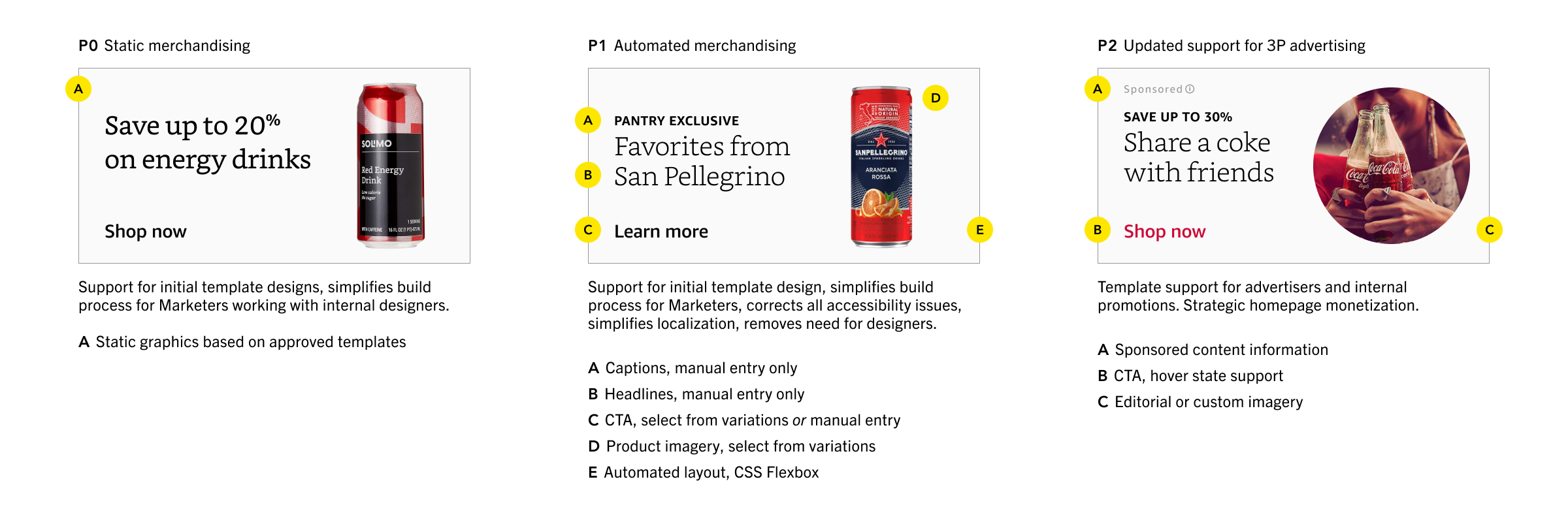
Excerpt from a 0-to-1 merchandising systems proposal used to align stakeholders—shifting from designer-owned static assets to templates, and ultimately to configurable modules that supported marketing, accessibility, localization, and advertising needs at scale.
Design story
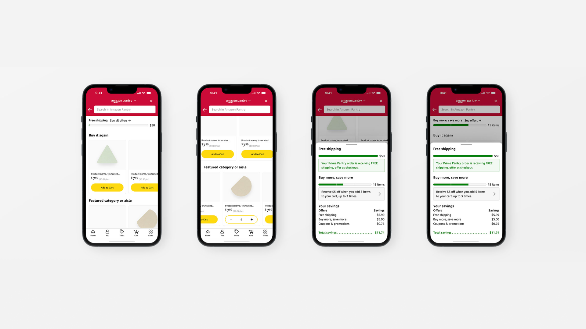
The core problem was not feature depth but conceptual clarity—users struggled to understand eligibility, thresholds, and savings at a glance.
The experience was reframed around helping customers build better baskets, not simply complete transactions—shifting focus toward assortment clarity, checkout usability, and perceived value.
Brand and product design were used together to reduce cognitive load and establish clearer expectations across the experience, with a focus on conversion rate optimization.
Threshold tracking was redesigned as a persistent, modular system that surfaced progress, savings, and offers contextually while shopping.
Messaging and UI were personalized based on user state (Prime status, offers, language), ensuring relevance without fragmenting the experience.
Design systems and modular components enabled rapid experimentation through A/B and multivariate testing.
Accessibility and localization were built into brand and component standards to support international and multilingual users.
Outcomes
A refreshed brand identity and updated product experience shipped as “Amazon Pantry.”
Improved clarity around eligibility, thresholds, and savings, reducing confusion during checkout.
Increased engagement, conversion rate, and average order value through clearer basket-building incentives and improved threshold tracking.
Introduced modular merchandising and automated layouts that reduced reliance on static assets and improved marketing scalability.
The work informed future grocery and everyday essentials experiences after Pantry was sunset.
Reflection
Designing at Amazon reinforced the importance of systems thinking—small clarity improvements compound significantly at scale.
Designing for diverse users reinforced the importance of context—there is rarely a one-size-fits-all solution at scale.
Close collaboration between product, design, and marketing was essential to aligning customer experience with business constraints.
The work demonstrated how branding, accessibility, and product design can function as infrastructure, not just surface polish.